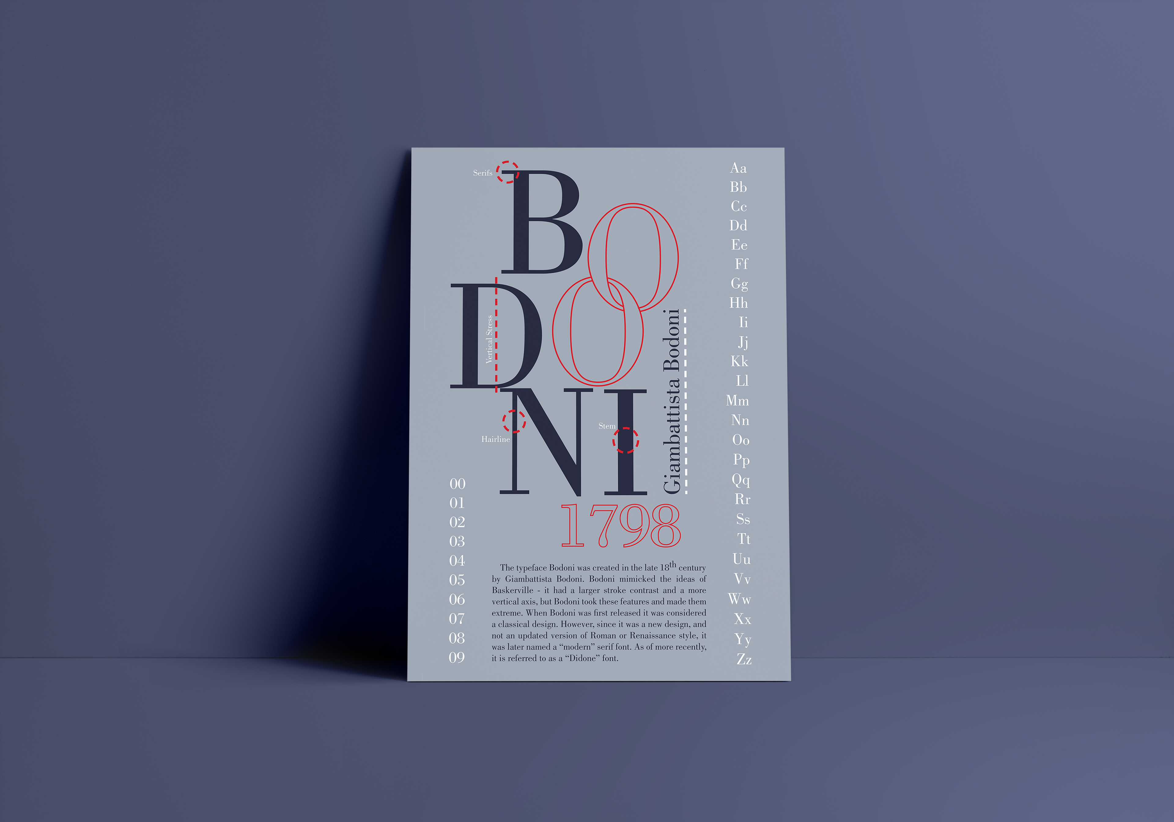
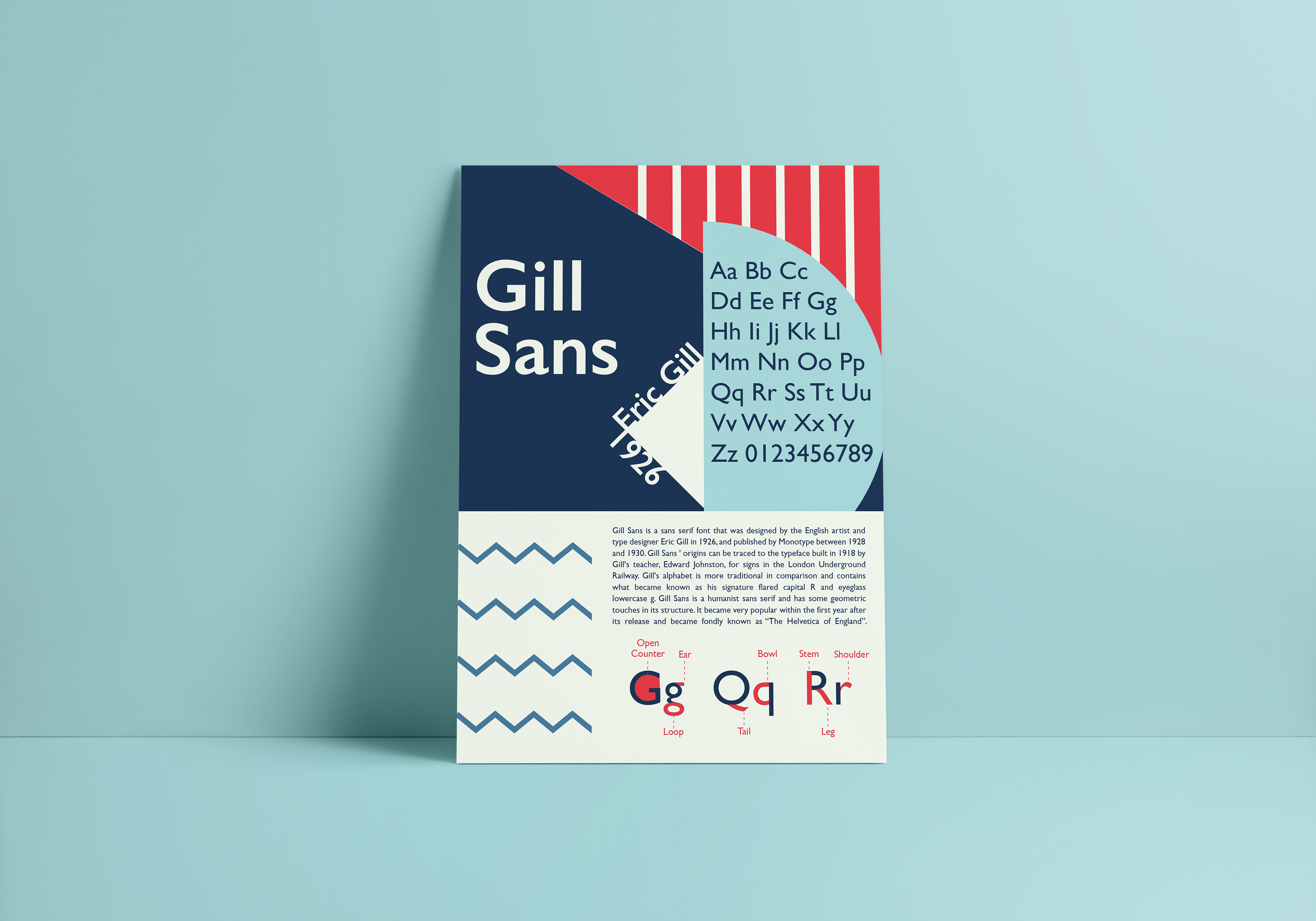
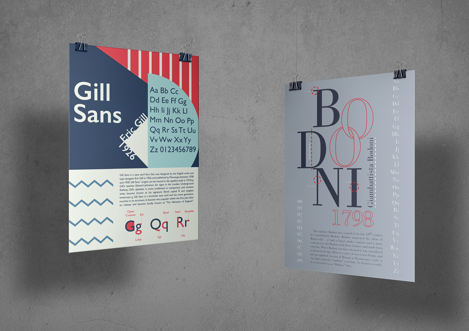
This was a project for my freshman year typography course, the challenge was to create two posters for two separate fonts. Each poster had to be a completely different style from the other. The fonts I had chosen were Bodoni and Gill Sans, which are some personal favorites of mine. I felt that these fonts would lend themselves to very different styles because Gill Sans is a very modern-looking san serif and Bodoni is a classic serif. For the Bodoni poster, I wanted the poster to have a very refined and professional tone. Meanwhile, on the Gill Sans poster I went for a very bold and dynamic look.
This is one of my favorite projects to this day, I feel like I really captured the distinct styles of each of these typefaces. The Gill Sans poster had a modern look with lots of energy. The fun shapes and lines lead a persons’ eyes across the page in a way that makes it easy to read. The Bodoni one has a much more serious and refined look. I struggled with the color scheme on this one for a while, I felt like I had tried every color combination with this poster. I’m happy with the palette I landed on, the grays and blues give it the serious tone I was going for but the red adds some visual interest and a pop of color.


