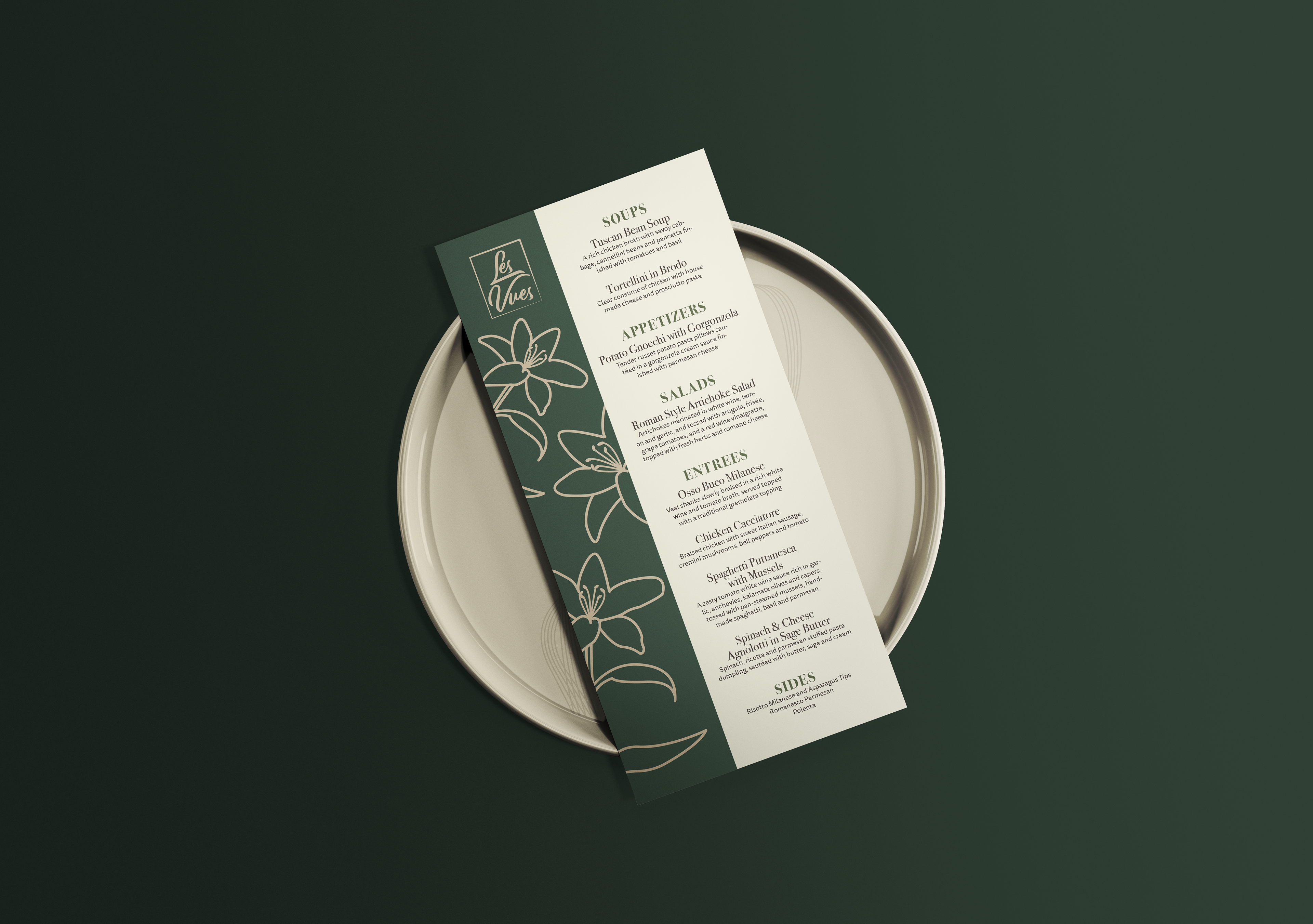
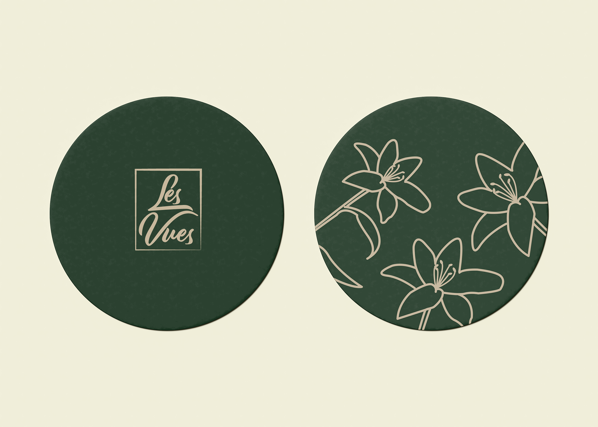
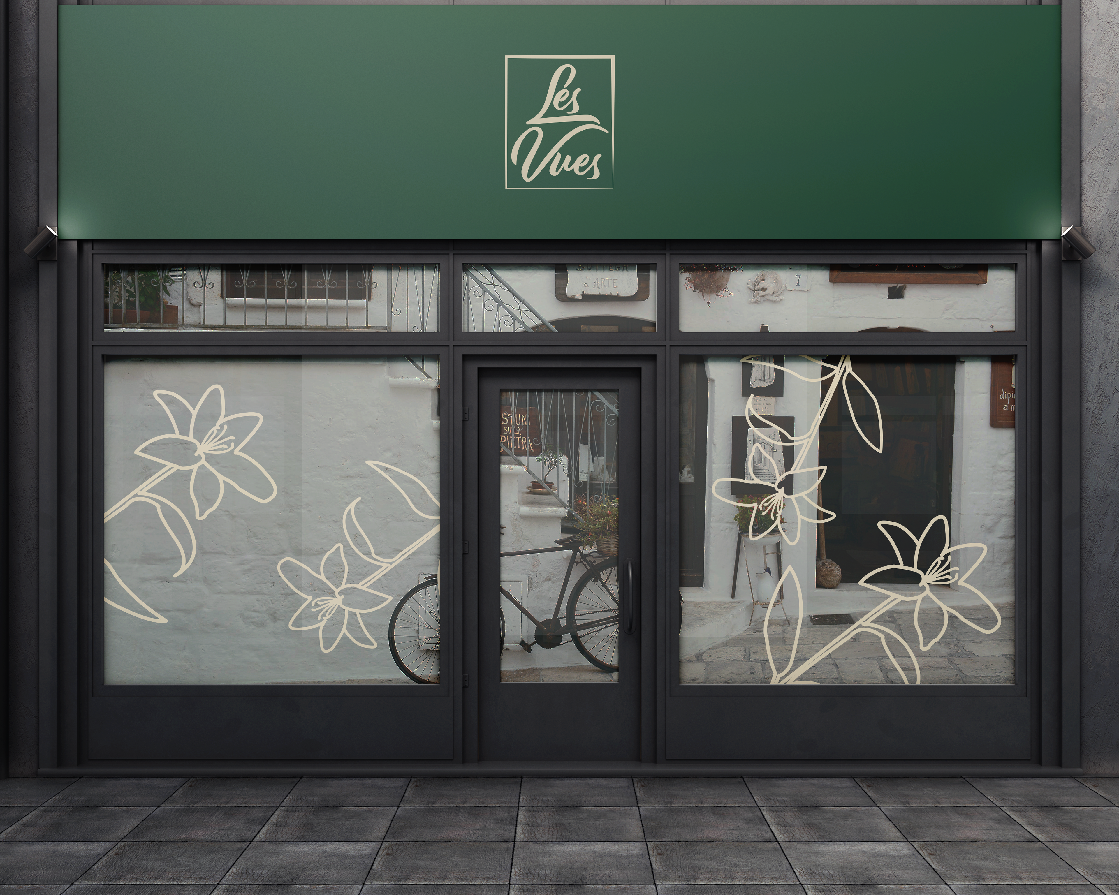
This was a project I was assigned in my editorial and publication class, the professor had brought in a chef who was teaching a dining course and needed menu designs for the food her students were serving. Her students were going to be serving different types of cuisine each night, in a fine dining setting. I was assigned to pick one of the types of cuisine they were offering and design a menu that could be translated over to all the other types of food if necessary. My idea for translating my design over to the other menus was to incorporate each country's national flower into the menu design, while also changing the color palette for each individual menu. The design elements that would stay consistent were the typography and the layout.
The thin layout of the menu gives a unique twist to a classy design. The earth tone color scheme complimented the fine dining Italian theme, without having to resort to using cliches such as the Italian flag color scheme. The font pairing is both sophisticated and elegant, which fits perfectly with the idea I was going for. The menu didn’t get chosen in the end, but I think it was a solid contender and a great experience.