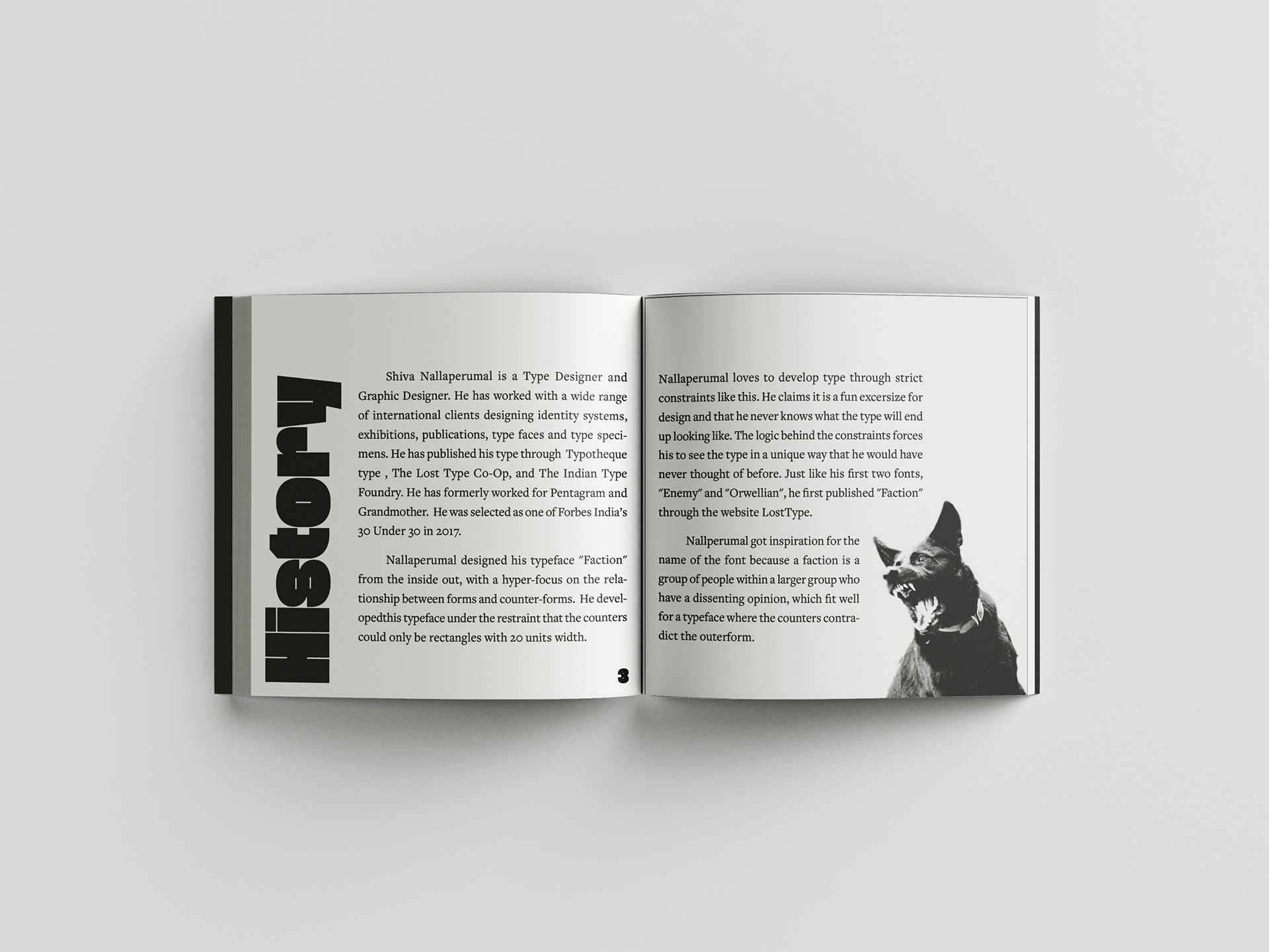
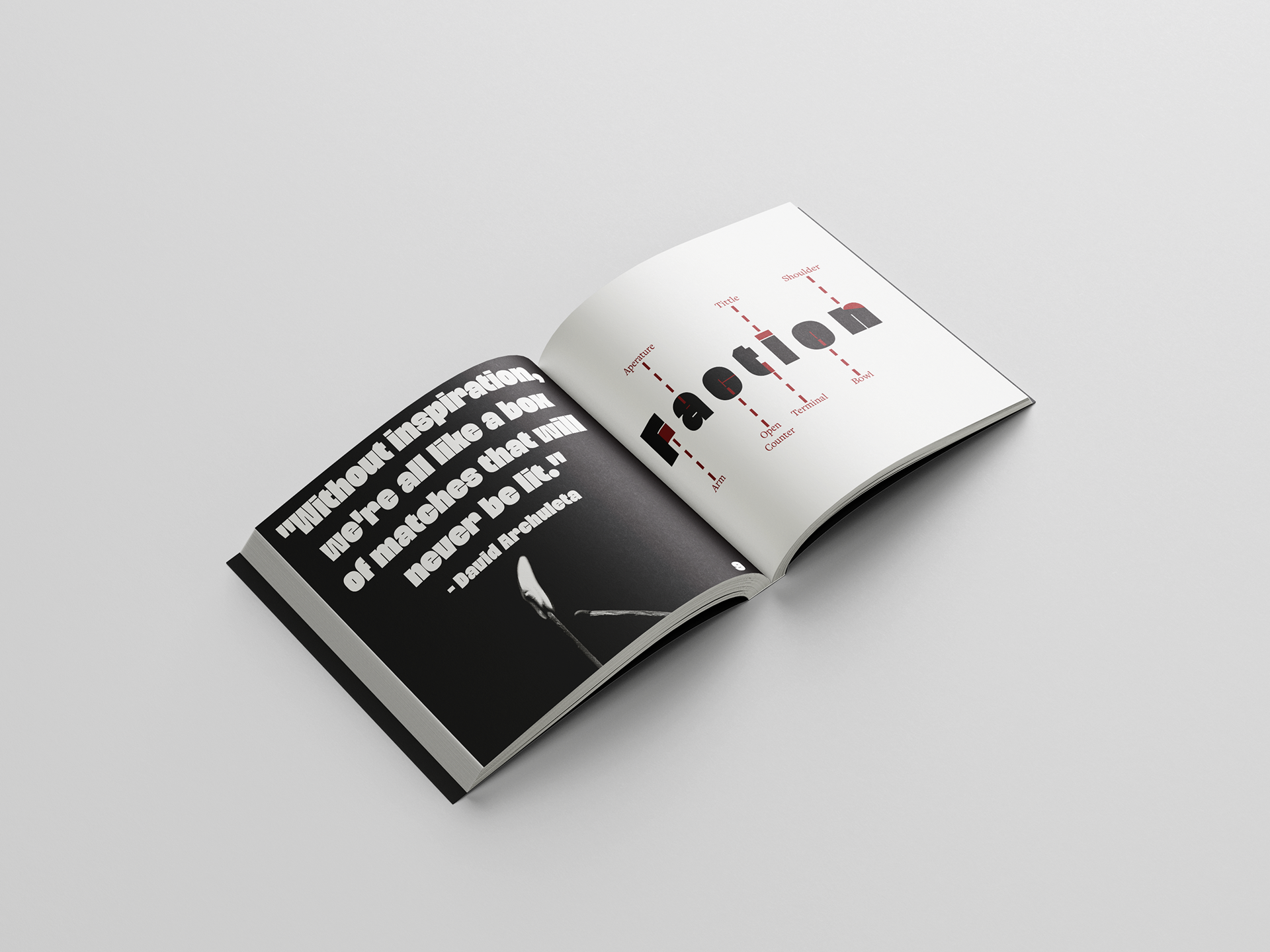
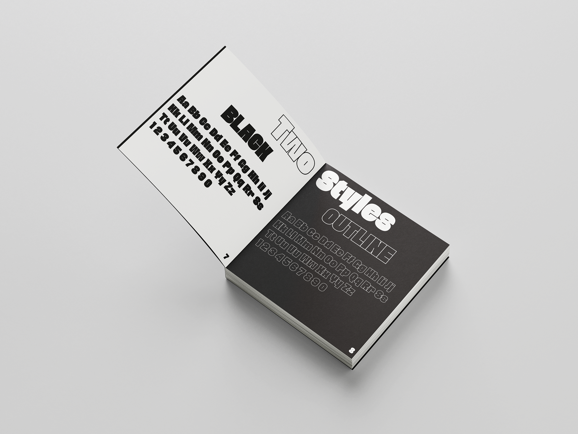
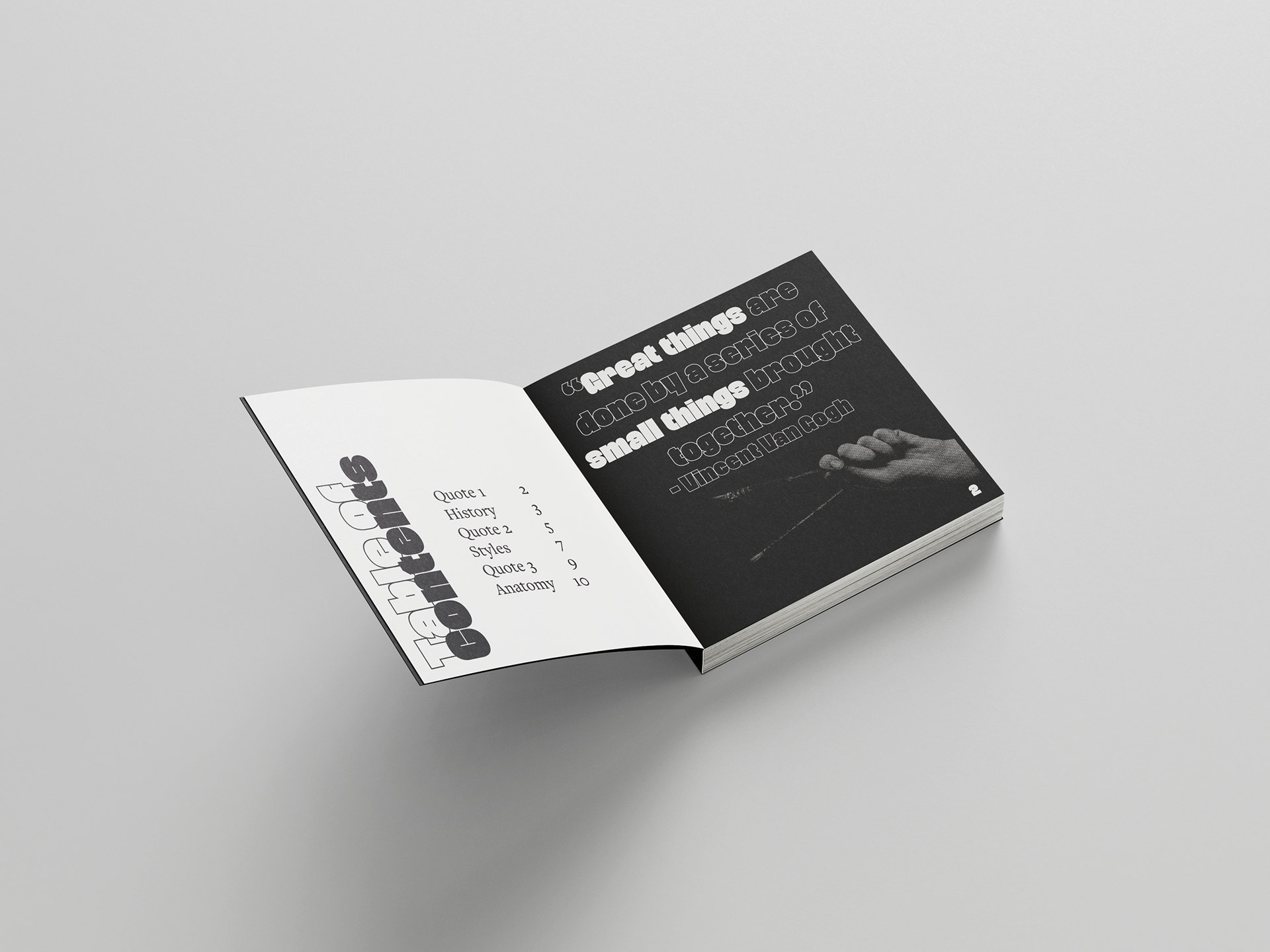
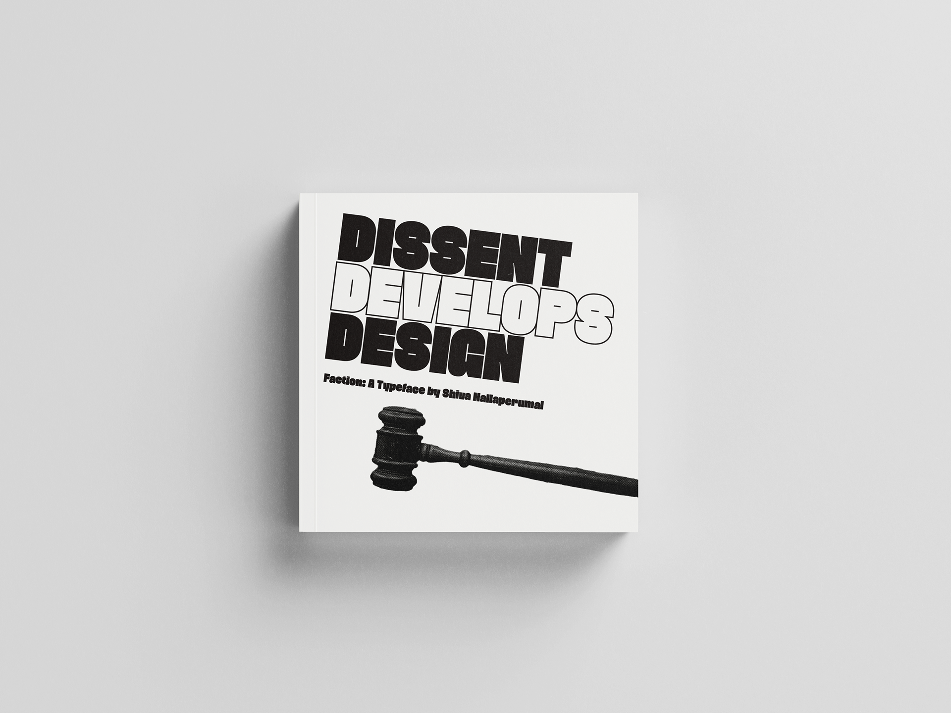
In this project, I was asked to create a book that showcases a typeface of my choice, and highlights the history and features of the font. I wanted to step out of my comfort zone for this project, so I went with a font that I wouldn’t have normally chose. This font is called “Faction”. It’s a heavy and intense font, and I wanted my book to reflect that. Since the tone of the font lent itself to edgier content, I decided to lean into that. I stuck with a black and white theme, and edited photos found on Unsplash to have higher contrast and make them look a bit punk. With the name of the font being Faction, I decided to stick to the theme of dissent in my content.
The outcome was very high contrast and intense, which suits this typeface well. The imagery and the colors appropriately set the tone. The layout and design choices made set the branding and theme and allow viewers to gather inspiration and see what Faction is all about.
