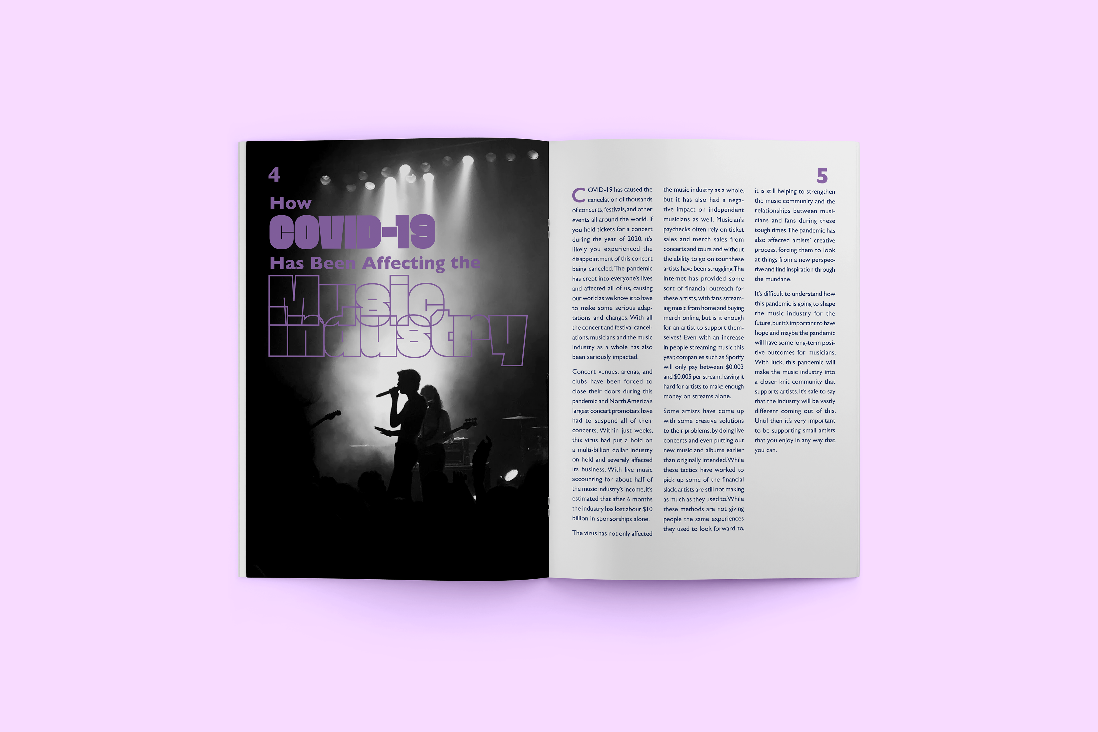
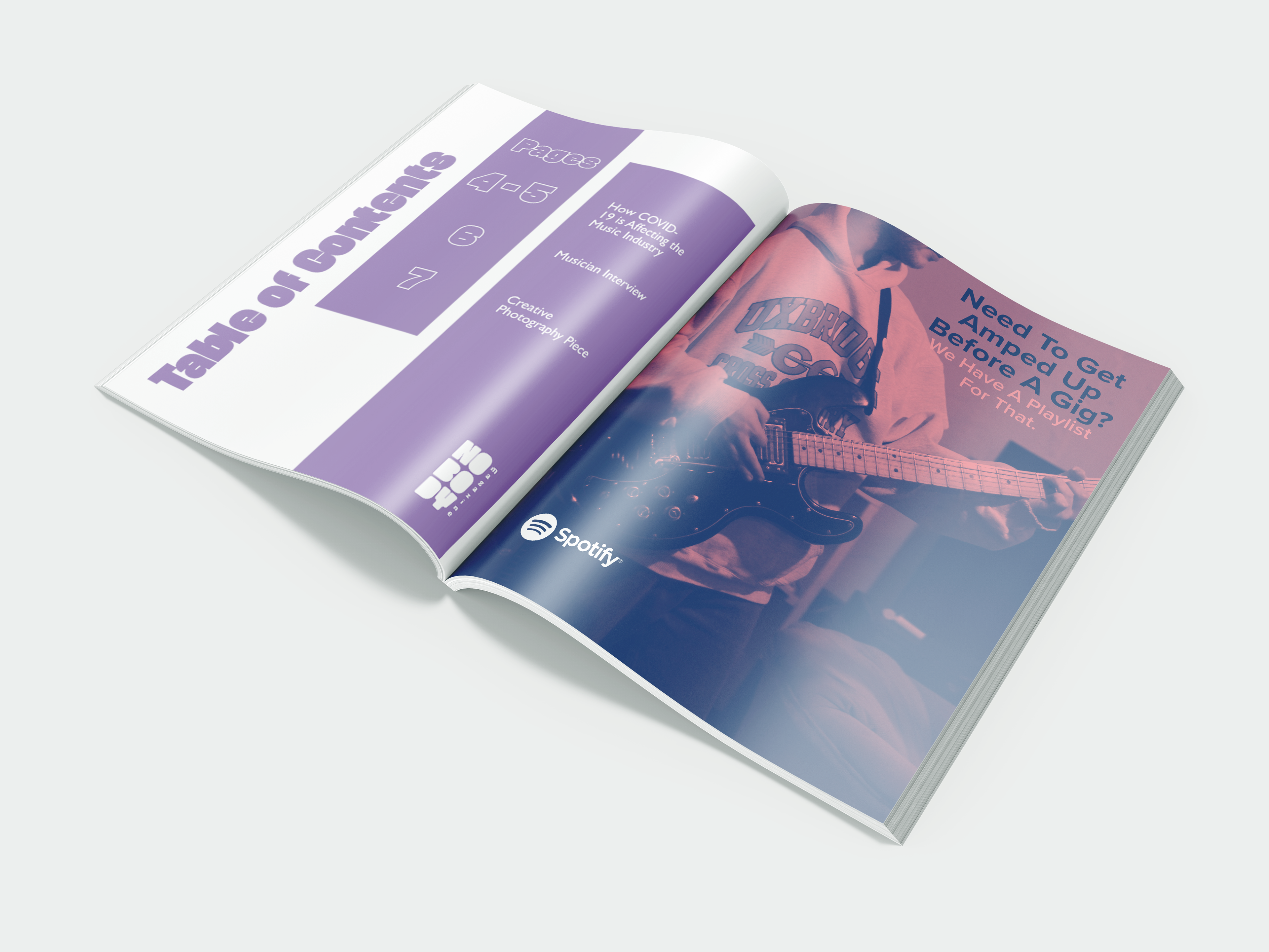
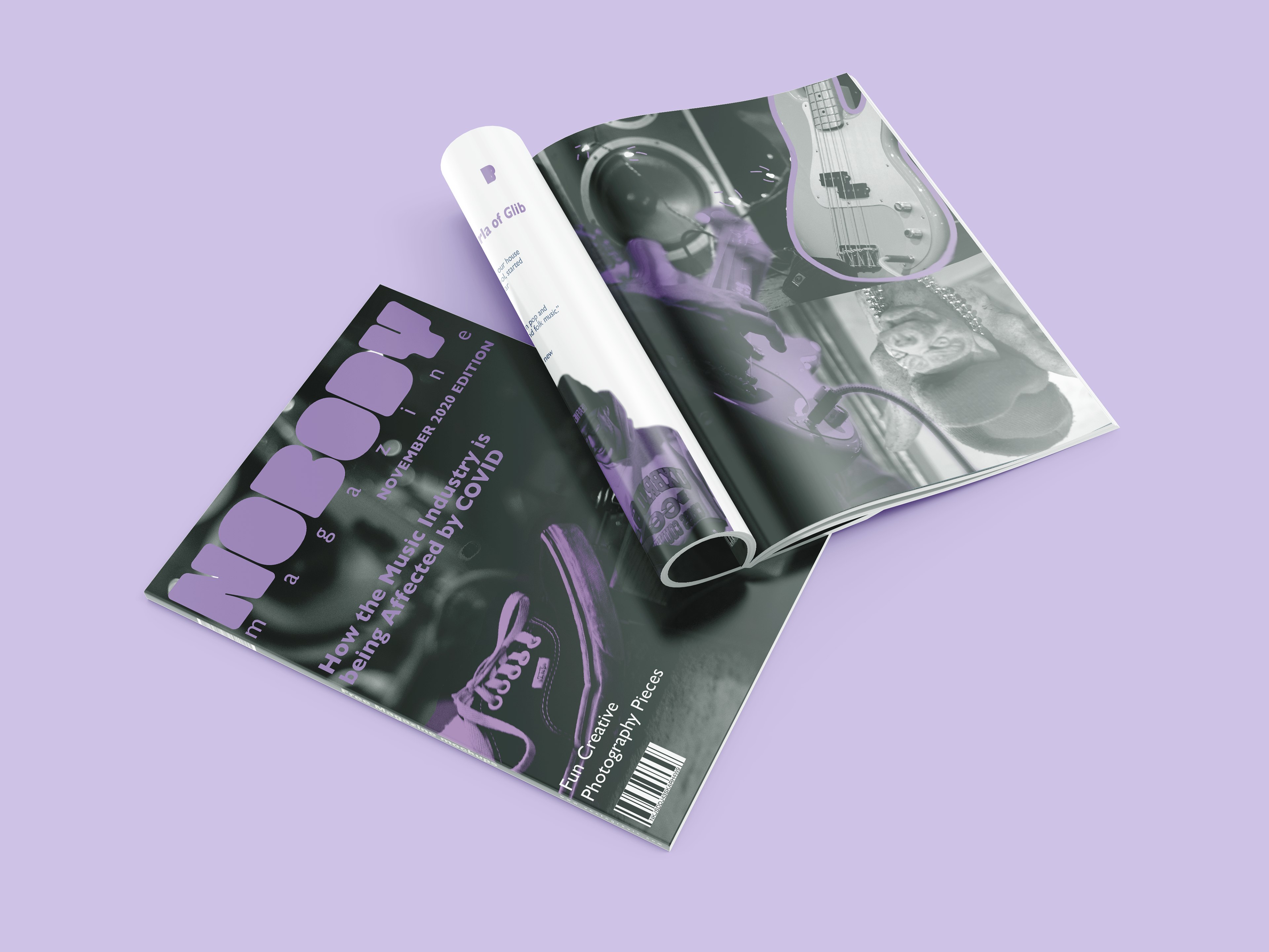
This was my final project in my sophomore level editorial class. I was asked to create my own minizine using original photography and writing. For the theme of my magazine I chose to focus on music and concerts. Getting original concert photography in the midst of a pandemic was a bit tough, but I had plenty of photos from past concerts and access to instruments that I could use for my photography in this piece.
I decided on making the magazine black and white, and I used the purple as a pop of color to catch the viewers eye. For the heading font, I chose something that was bold and stood out. I ended up choosing Faction for the heading font, and an edited version of it for the logo. The color scheme creates a look of cohesion, and the black and white photography adds a look of consistency to each page. Throughout the magazine there is consistent branding and a well organized layout. I don’t get to use my photography and editing skills in a lot of my projects, so I was excited to get to bring out my camera for this one. The photos reveal an edgy tone that that gives this piece its own personality.
